
Custom Website vs Website Builder: Which One Actually Converts Better?
6/30/2026
Read More →
Most people ask this question because they want to know whether a landing page should be short and simple or long and detailed.
That is the right question to ask, but the answer is not only about word count.
A landing page should be long enough to explain the offer, build trust, answer the visitor’s main questions, and get them to take action. But it should also be short enough to avoid distracting people from the conversion goal.
So, how long should a landing page be?
For many campaigns, a landing page will fall somewhere between 500 and 1,000 words. Simple offers may need fewer than 300 words. More complex, expensive, or high-trust offers may need 1,200 words or more.
The better rule is this: your landing page should be as long as the decision requires.
If the visitor already understands the offer and the action is low commitment, the page can be short. If the visitor needs more proof, more explanation, or more trust before taking action, the page usually needs to be longer.
A landing page should usually be between 500 and 1,000 words, but the right length depends on the offer, audience, traffic source, and conversion goal.
A short landing page can work well for simple offers, warm traffic, newsletter signups, downloads, and discounts. A longer landing page usually works better for paid ad campaigns, high-ticket services, B2B offers, healthcare, legal, finance, addiction treatment, and other decisions that require more trust.
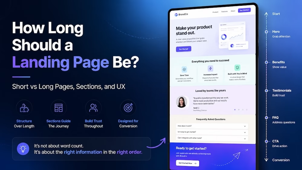
Length is not only about the number of words. It is also about the number of sections, the amount of imagery, the depth of explanation, the proof needed, and how easy the page is to scan.
| Landing Page Section | Typical Length | Purpose |
|---|---|---|
| Hero section | 25 to 75 words | Explain the offer quickly and give one clear call to action |
| Problem or pain point section | 75 to 150 words | Show the visitor you understand why they are there |
| Benefits section | 100 to 250 words | Explain what the visitor gets and why it matters |
| How it works section | 75 to 200 words | Reduce confusion and explain the process |
| Social proof section | 50 to 200 words | Add testimonials, reviews, logos, results, or trust signals |
| Details section | 150 to 400 words | Explain features, services, pricing, inclusions, or important decision factors |
| FAQ section | 150 to 500+ words | Handle objections and answer questions without crowding the main sections |
| Final CTA section | 25 to 75 words | Repeat the offer and make the next step easy |
This structure matters because people scan before they read.
A landing page can be long, but it should still feel easy to move through. If someone lands on your page and sees a wall of text with no headings, no spacing, and no visual breaks, they will leave regardless of whether the page is 300 words or 3,000 words.
The sections in the table above are not mandatory for every page. A simple lead magnet might only need a hero section, a short benefits list, and a form. A SaaS product with a free trial might skip the “how it works” section entirely if the product is self-explanatory. A high-ticket coaching program might need every single section plus a video.
The key is to include only the sections that move the visitor closer to the decision.
Short landing pages are usually under 400 words and fit within one to two scrolls on a desktop screen. They work best when the visitor already knows what they are getting and the barrier to action is low.
Here are the specific conditions where a short page outperforms a long one.
The offer is free or low-cost. If you are giving away a PDF guide, a checklist, a discount code, or a free consultation, the visitor does not need to be convinced of the value. The value is obvious or the risk is zero. A long page only adds friction.
The traffic is warm. Visitors coming from an email list, a retargeting ad, or a referral link already know who you are. They have some level of trust. You do not need to reintroduce your company or spend time building credibility from scratch. You just need to remind them of the offer and give them a clear path forward.
The action is a single step. If the conversion goal is a newsletter signup, a webinar registration, or a button click to start a free trial, the decision is binary. The visitor either wants it or they do not. Additional text will not change their mind. It will only distract them.
The page is for mobile-first traffic. Mobile users scroll less and have shorter attention spans. They are often browsing in between other tasks. Short pages with large buttons and minimal text convert better on mobile.
A good example of a short landing page is a lead magnet page. The headline states the benefit of the guide. A short paragraph explains what is inside. A bullet list highlights three to five key takeaways. A form collects the email address. That is it. No testimonials, no case studies, no FAQ. The visitor came for the guide and the page lets them get it quickly.
Long landing pages are usually over 1,000 words and require multiple scrolls. They work best when the visitor needs to be educated, persuaded, or reassured before they feel comfortable taking action.
Here are the conditions where a long page is necessary.
The product or service is expensive. When someone is spending hundreds or thousands of dollars, they need to justify that decision to themselves. They need to see that the price is fair, the results are real, and the risk is managed. A short page feels shallow for a big decision.
The traffic is cold. Visitors from search engines, display ads, or social media ads often have no idea who you are. They clicked on a headline or an image because something caught their attention, but they have no context. They need to be introduced to your brand, your approach, and your credibility before they will take action.
The offer has multiple components. If your offer includes a core product, plus bonuses, plus support, plus a community, you need to explain each piece. Visitors want to know exactly what they are getting. A short page forces you to leave things out, which creates uncertainty.
The buyer journey requires education. Some offers are not intuitive. If you are selling a software tool, a financial service, a medical treatment, or a B2B solution, the visitor may not even know what questions to ask. You need to walk them through the problem, the solution, and the outcome step by step.
The competition is strong. If the visitor is comparing you to three or four other providers, your page needs to make the case for why you are the best choice. That requires depth. It requires case studies, comparisons, specific results, and detailed explanations of your process.
A long landing page does not mean a boring page. It means a page with many sections, each serving a specific purpose. The visitor should be able to scroll quickly, read the headings, stop on the sections that matter to them, and ignore the rest.
Very short landing pages often fail because they assume the visitor already wants the offer. That assumption is rarely true. Most visitors arrive with skepticism, confusion, or simple curiosity. A short page does not give them enough information to move from curiosity to action.
Very long landing pages often fail because they lose the visitor’s attention. Even if the content is good, most people will not read 2,000 words on a single page. They will scroll to the bottom, get overwhelmed, and leave. Long pages need to be scannable, not just readable.
The sweet spot is a page that is as long as it needs to be and no longer. That sounds vague, but you can determine that length by answering three questions about your specific campaign.
Question one: what does the visitor already know? If they already know your brand, your offer, and your value, the page can be short. If they know none of those things, the page needs to be longer.
Question two: what objections will the visitor have? List every reason someone might not buy. Price, trust, implementation, support, quality, competition. If you have one or two objections, a short page with a brief explanation may be enough. If you have five or six, you need sections to handle each one.
Question three: what is the cost of inaction? If the visitor can afford to ignore the offer and come back later, they will. A short page does not create urgency. A long page can remind them of the problem they are trying to solve and why solving it today matters.
The length of a page is not the problem. The problem is a page that feels long. You can have a 1,500-word page that feels short if it is structured properly. You can also have a 400-word page that feels like a chore to read.
Here is the structure that keeps people scrolling.
Start with a tight hero section. The headline and subheadline should tell the visitor what the offer is and why it matters. Do not put a long introduction here. That comes later. The hero section is for attention and action, not explanation.
Add a short problem section. Two or three sentences that acknowledge the visitor’s situation. This is where you say, “We know you are struggling with X” or “You have probably tried Y and it did not work.” This builds rapport and tells the visitor they are in the right place.
Follow with benefits, not features. Benefits are what the visitor gets. Features are what the product does. A benefit is “save three hours per day.” A feature is “automated reporting.” Benefits connect to the visitor’s goals. Features connect to the product. Lead with benefits.
Include social proof early. Do not bury testimonials at the bottom of the page. Put a strong testimonial or a trust badge after the benefits section. This builds credibility before the visitor starts looking for reasons to doubt you.
Add a “how it works” section only if the process is unclear. If the visitor can figure out what to do next without explanation, skip this section. If the offer requires multiple steps or has a learning curve, explain it with three simple steps and a visual.
Use an FAQ section to handle remaining objections. This is where you put the detailed explanations that would clutter the main sections. Price questions, compatibility questions, refund policy, support hours, setup time. Put them all here. Visitors who need these answers will find them. Visitors who do not need them will scroll past.
End with a strong, repeated CTA. The final CTA should mirror the hero section but with added confidence. The visitor has now read the entire page. They have the information they need. The CTA should assume they are ready and make the next step feel inevitable.
Text length is only one part of the equation. Visuals break up the text and make the page feel shorter.
A 1,500-word page with ten images, two videos, and several diagrams feels like a 500-word page. The images give the reader’s eyes a rest. They also provide additional information without adding to the word count.
A 500-word page with no images and no spacing feels like a 2,000-word page. The text is dense and difficult to scan.
Use screenshots to show the product in action. Use charts to show results. Use photos of real people to build trust. Use icons next to bullet points to make lists easier to process.
Avoid stock photos that do not add meaning. A generic image of a person smiling at a laptop does not help the visitor make a decision. It takes up space without providing value. That type of visual makes the page feel longer because the visitor has to scroll past it without gaining anything.
Several large-scale studies have analyzed landing page length across thousands of campaigns. The findings are consistent.
Short pages convert better for simple, low-commitment offers. Long pages convert better for complex, high-commitment offers.
One study from Unbounce analyzed over 70,000 landing pages. They found that the average conversion rate for pages with fewer than 300 words was around 10 percent higher than pages with 300 to 600 words. But for pages with more than 1,000 words, the conversion rate increased again, specifically for B2B and high-ticket B2C offers.
That U-shaped curve suggests that the worst length is the middle. A page with 400 to 700 words is often too long for simple offers and too short for complex ones. It commits to neither approach.
If you are going to write a short page, commit to it. Keep it under 300 words. Remove everything that is not absolutely necessary. If you are going to write a long page, commit to it. Go beyond 1,000 words and structure it properly.
Stop looking for a universal word count. Start looking at your specific offer and audience.
Ask yourself these four questions before you write a single word.
What is the price or commitment level? Low price means short page. High price means long page.
Where is the traffic coming from? Cold traffic needs education. Long page. Warm traffic needs a reminder. Short page.
How many objections does the visitor have? One or two objections. Short page with a quick handling section. Five or more. Long page with a dedicated FAQ.
How unique is your offer? If you are the only provider in your space, the page can be shorter because the visitor has fewer alternatives. If the market is crowded, you need a longer page to differentiate yourself.
Once you answer these questions, you will know which direction to go. From there, the only reliable way to confirm your choice is A/B testing.
Testing is the only way to know for sure what works for your specific audience.
Run an A/B test with two versions of the same landing page. One version is your short page. The other is a long version with all the extra sections. Split your traffic evenly. Measure conversions, not just clicks.
If the short page wins, keep it short. If the long page wins, keep it long. If the difference is small, choose the shorter version because it requires less maintenance and loads faster.
Do not test a medium-length page against a long page. The middle is rarely the answer. Test the extremes and see which one performs better.
The length of your landing page should match the size of the decision your visitor needs to make.
If the decision is small, keep the page small. If the decision is large, give the visitor the information they need to make it with confidence.
Do not write a long page because you think more words mean more convincing. More words without structure or purpose will only hurt your conversion rate. Write only what is necessary. Remove everything else.
Your landing page is done when you cannot remove another word without hurting the visitor’s ability to understand the offer and take action.